Hostelworld list widget redesign
1620041528805
Today, I’m delighted to announce that we’ve just moved the new Hostelworld list redesign to general release.
Design Updates
Big image. We know excellent images are a huge boost to conversions. The previous widget didn’t quite make the most of the hostel’s image. In this new design, the image is large and looks great no matter what the user’s screen size
Improved responsiveness. Previously, the widget was simply taking into account the overall screen size. This wasn’t ideal as sometimes the space allocated to the widget was quite narrow, so it was trying to squeeze a desktop-sized layout into a tablet-sized space. This is no more and now the widget will adapt much better to the space allocated to it.
Much better use of space. In the older design, there was often a very poor use of space. In the updated design, space is used much more effectively, giving the reader a much more pleasurable experience
Animated “glow” is now on the button to highlight the call to action
All other exclusive Referextra goodies are there, like the “times booked today”, the latest and best review snippet, and the custom information you can add. It’s all just presented much better now. :)
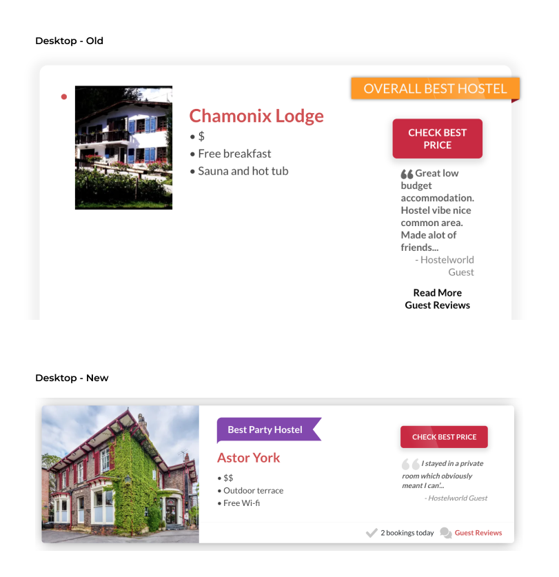
Desktop - before and after
You can see that we’ve got a lot of unoptimised space in the layout. I intentionally screenshot the widget at an awkward resolution for the sake of comparison, but still, the difference is striking.
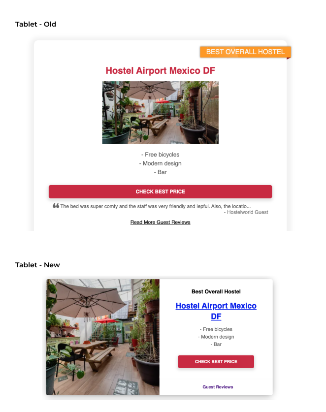
Tablet - before and after
Again, on tablet you can see that we were not optimising the image size.The alignment is all off too, with some elements taking up the full width, and some elements not. The refreshed design fixes all of these issues.
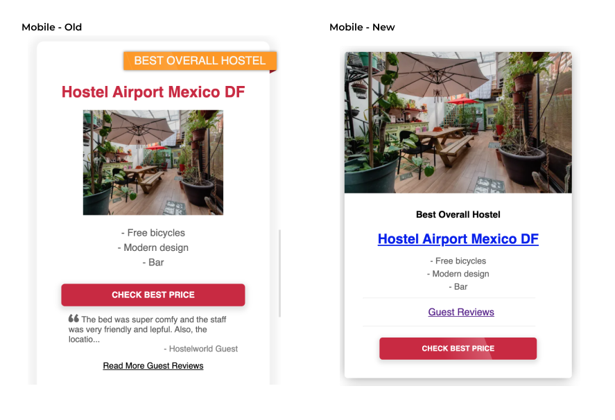
Mobile - before and after
The biggest difference on mobile is, again, the image. Much better use of space and a more manageable visual flow for the reader. The review snippet has been relegated to only be for desktop in order to optimise the real estate available.